Exploring Every Chart Type Available on TradingView: A Complete Guide
TradingView offers a massive variety of chart types beyond the standard candlestick, each designed to highlight different aspects of market data such as price, volume, volatility, or time. A recent update video on the TradingView YouTube channel walked through every single chart type available on the platform and explained how to use them.
Here is a breakdown of the different chart categories and what they are best used for.
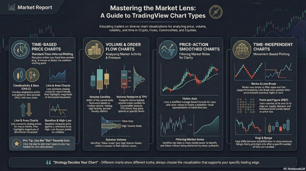
1. Time-Based Price Charts
These are the standard charts most traders are familiar with. They plot price action over specific time intervals (e.g., 5-minute, 1-hour, Daily).
Bars (OHLC): Displays the Open, High, Low, and Close. They provide the same data as candlesticks but with minimal visual noise, making them excellent for structured price analysis.
Candles: The most popular chart type. The thick body shows the difference between the open and close, while the wicks show the highs and lows. Best for price action and pattern recognition.
Hollow Candles: Similar to standard candles but incorporates the relationship between the current close and the previous close, helping to highlight momentum shifts.
Line: Connects only the closing prices, filtering out intraday noise. Excellent for identifying the overall, macro trend direction.
Line with Markers: A line chart that adds a visible dot at each closing price.
Step Line: Displays price in vertical and horizontal “steps” rather than smooth diagonal lines, highlighting discrete price changes.
Area: Fills the space below a line chart with color, visually emphasizing directional movement.
HLC Area: An area chart based only on the High, Low, and Close (ignoring the open), offering a slightly smoother representation.
Baseline: Compares price relative to a chosen reference level (e.g., 50%). Great for evaluating performance relative to a specific starting point.
Columns: Represents price movements via vertical columns, offering a simplified visual of price gain/decline.
High-Low: Displays only the high and low values for each period, focusing entirely on range and volatility.
2. Volume & Order Flow Charts
These charts incorporate volume data directly into the visual structure of the price action.
Volume Candles: The width of each candlestick changes based on trading volume. A thick candle means high volume, while a thin candle means low volume.
Volume Footprint: Displays the exact bid and ask volume inside each candle. This is an advanced order-flow tool used to see exactly where aggressive buyers and sellers are stepping in.
Time Price Opportunity (TPO): Also known as Market Profile. It visualizes how much time price spends at specific levels, helping to analyze market structure and “fair value” balance.
Session Volume: Displays the volume traded at each price level during a defined session, highlighting High Volume Nodes (reaction zones) and Value Areas.
3. Price-Action Smoothed Charts
These charts modify traditional price data to filter out market noise and make trends easier to spot.
Heikin Ashi: Uses a modified formula based on averages rather than raw open/close data. It smooths out price movements, making it much easier to ride long trends without getting shaken out by minor pullbacks.
4. Time-Independent Charts
These advanced charts ignore the concept of time entirely. A new bar or brick is only printed when price moves a specific, pre-defined amount. They are purely focused on volatility and price movement.
Renko: Forms “bricks” only after price moves a set amount. Excellent for filtering out market noise and identifying clear support/resistance levels.
Line Break: Creates a new line only when the price exceeds the previous high or low, filtering out small fluctuations.
Kagi: Changes direction based on predefined reversal amounts, shifting between thick (upward pressure) and thin (downward pressure) lines.
Point and Figure: Focuses purely on price movement size (using Xs and Os) to map out supply, demand, and breakout levels.
Range: Prints a new bar only when the price has traveled a specified “range” (e.g., 10 ticks), regardless of how long it takes.
How to Switch and Customize
You can easily switch between these charts using the drop-down menu at the very top of the TradingView interface.
Pro Tip: If you find a few chart types you like (e.g., standard Candles, Volume Candles, and Renko), click the “Star” icon next to them in the drop-down menu. This will add them to your top toolbar for quick, one-click access.
As the video concludes: Different charts show different truths about the same market. Your strategy should decide your chart.
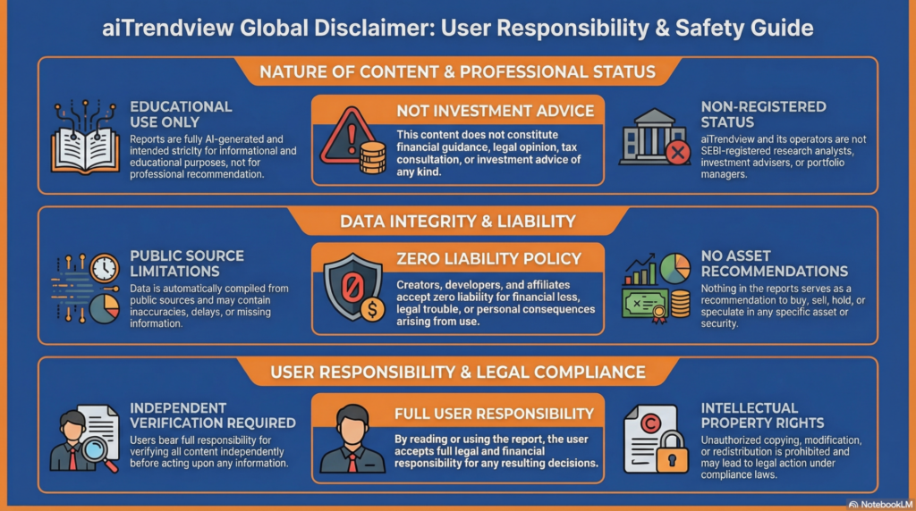
Legal Disclaimer & Liability Waiver
aiTrendview Disclaimer
This AI-generated report is strictly educational and does not constitute financial, legal, or professional advice. aiTrendview and its affiliates are not SEBI-registered advisors and assume zero liability for any losses or consequences resulting from its use. All data is autonomously harvested from public sources and may be flawed, delayed, or incomplete; therefore, you assume exclusive responsibility for independently verifying information before taking any action. Under no circumstances should this content be construed as a recommendation to trade or speculate in any security. By accessing this material, you acknowledge that any reliance on this data is at your sole risk, and you agree to be bound by strict intellectual property protections prohibiting the unauthorized redistribution or modification of this work.